Looking south to the upper Gulf of California and the Colorado River delta
Many years ago, in the late 1990’s, I had the privilege and pleasure of working with Karl Flessa at the University of Arizona. I had gone there as a researcher to participate in Karl’s Gulf of California project, as one component of the project involved a group of marine bivalves (clams) on which I was an expert. The goal of the project was to assess the changes that had taken place, and were ongoing, in the northern Gulf after damming of the Colorado River. By the time that we were working there, it had been several decades since freshwater flowed into the former river delta in any appreciable volume. Almost all the water, which is generated largely from snowmelt in the Rocky Mountains, is now utilized by the western United States and Mexico. The changes were profound; increases of salinity, increased tidal influence, changes of dominant species and so on, much of which has been documented by the aptly named CEAM (El Centro de Estudios de Almejas Muertas). This was my first introduction to the then nascent field of conservation paleobiology, which has since developed into a major subdiscipline of the paleobiological sciences. The community is now centered around the Conservation Paleobiology Network, a great resource for learning more. The goal of conservation paleobiology is to apply paleontological and geological work, primarily of past species and ecological systems, to understanding, conserving, and regenerating current ecological systems.
Roxanne Banker, Scott Sampson and I published a conservation paleobiology paper last year in which we proposed a new approach to both conservation biology and paleobiology, the Past-Present-Future (PPF) strategy. The idea is to use conservation paleobiology as a rubric to combine diverse data streams, e.g. fossils, historical data, indigenous knowledge, with mathematical modeling to reconstruct historical and current systems, and apply the results to conservation in the near-term future. The paper focused on the role of an extinct sirenian (manatees, dugongs), Steller’s Sea Cow, in the dynamics of North Pacific giant kelp forests. Those forests have been devastated during the past decade by marine heat waves, and the loss of sunflower sea stars, a major predator of the kelp-consuming purple sea urchin. We found that kelp forests would have, under many circumstances, been more resilient to those disturbances in the presence of the sea cow. Unfortunately, the sea cow was driven (consumed) to extinction in the early to mid-18th century, shortly after its discovery by Russian commercial hunters.
Recently Scott and I have published an opinion piece in Scientific American magazine, We Need to Think about Conservation on a Different Timescale, in which we more broadly advocate for the PPF approach and conservation paleobiology. The mathematical modeling of historical and ancient ecosystems can be extremely challenging, but as we showed in our paper, and argue in this opinion article, it is both feasible and bears great potential. As we state in the closing of the article: “We are all characters in an epic story that has been unfolding for millions upon millions of years. The decisions we make today will shape how the future unfolds. It’s high time we embraced our role in this ever-evolving drama and established vital through lines from past to future.“
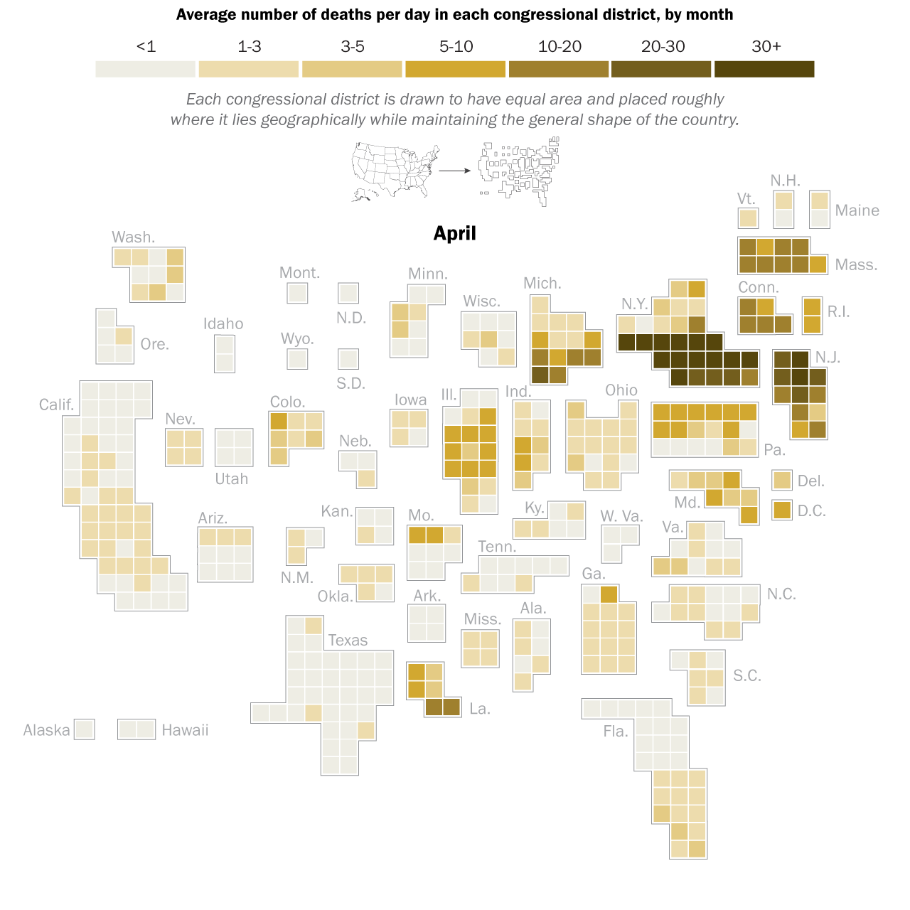
I had the great pleasure of giving a presentation last week about this COVID-19 and economics work to a very interesting research group, the ASPIRE (Adaptive Social, Psychological, and Information Response to Emergencies) Collaboratory. It’s a great group of very interesting people! Assembling the presentation really forced me to think about the entire narrative thread of what we did in our own study, and I was able to align the pieces better into a good storyline. In the previous blog post I explained the mathematical models underlying our counterfactual exploration, but the first interesting result did not actually come from the simulation of any particular SES (socioeconomic system) following outbreak of COVID-19 in early 2020, but actually from considering how an SES would respond to any sort of COVID-19 outbreak. What is “any sort” referring to? It means that early in 2020, the impact of COVID-19 varied greatly across societies and geography. Much of this variation can be tied to the timing of the disease’s arrival to a particular place. In general, the earlier the outbreak, the more severe were the consequences. This was true of the first hot spot in Europe, northern Italy, as it was of the first hot spot in the United States, New York City (see the graphic below). It must also have been true in Wuhan, the probable ground zero of COVID-19, and other large Chinese cities to where people would have traveled extensively before it was apparent that an epidemic was underway. All this variation created not only uncertainty about the nature of the disease, but also variation in the severity of initial outbreaks.
April 2020. Source: Pew Research Center analysis of COVID-19 Data Repository from the Johns Hopkins University Center for Systems Science and Engineering as of Dec 3, 2020. See methodology for details. “The Changing Geography of COVID-19 in the U.S.”
This uncertainty can be expressed as variation of the “infection rate”, the in the SIR model or, in our case, the estimate of the initial infection rate of an outbreak, the notorious R0 (pronounced R nought for my American friends). R0 is generally specific to particular circumstances defined by such factors as geography, geographic connectedness, and local factors such as population size, individual movements, and of course the contagiousness of the disease itself. In the case of COVID-19, those estimates varied roughly between 2 and 4, which are the number of persons expected to be infected by an infected person in a given time period. R0 less than 1 means that the disease will die out, while R0>1 means that it will spread through the population. The actual estimates for our Californian SESs at the beginning of March, 2020 ranged from a low of 1.59 for San Jose-Sunnyvale-Santa Clara, to a high of 2.63 for Stockton-Lodi (obtained from the California Department of Public Health’s California COVID Assessment Tool, CalCAT).
We were interested in the general question of how each SES would respond economically across a range of R0 values, given the counterfactual situation where the economies would remain open. To do this, we simply simulated the model (see this post), relating outbreaks of COVID-19 to losses of employment, for each SES at R0 ranging from 1.01-6, for 150 days. This would allow us to both see what the model predicts in general, as well as compare SESs. The results are best understood by looking at the following three dimensional plot. The axes at the base are your conventional x and y axes, with x representing the day of the simulation, and y the value of R0. The z or vertical axis shows the normalized level of employment in the SES, normalized meaning that a value of 1 represents the original employment level on March 1, 2020, and 0 meaning a complete loss of the workforce. The surface of the plot itself therefore shows the level of employment on any given day at any value of R0.
The figure here is for the Los Angeles-Glendale-Long Beach SES, and if you look closely you will see that there are actually two surfaces plotted. The upper transparent grey surface plots the fraction of employees lost directly to infection by COVID-19, which would result in either death or illness so severe as to lead to a loss of employment. Note that the surface is basically flat both early in time, and at low values of R0. However, as either time passes and the disease spreads, or the infection rate increases, or both, there is then a rapid decline of employment–that noticeable dip of the surface. It eventually levels off again as the disease has peaked. There is a second and lower surface, the colourful one. That surface shows the TOTAL loss of workers, that is, workers lost directly to infection (the grey surface), PLUS workers who subsequently lose their jobs because productivity and demand in their industrial sector, basically economic activity, are reduced by the diminished workforce. This is the economic cascade, and it will always be at least as severe as the disease-only cascade. This result therefore is the estimate that we have been seeking–the number of employees that would be lost as a consequence of maintaining an open economy during an outbreak of COVID-19.
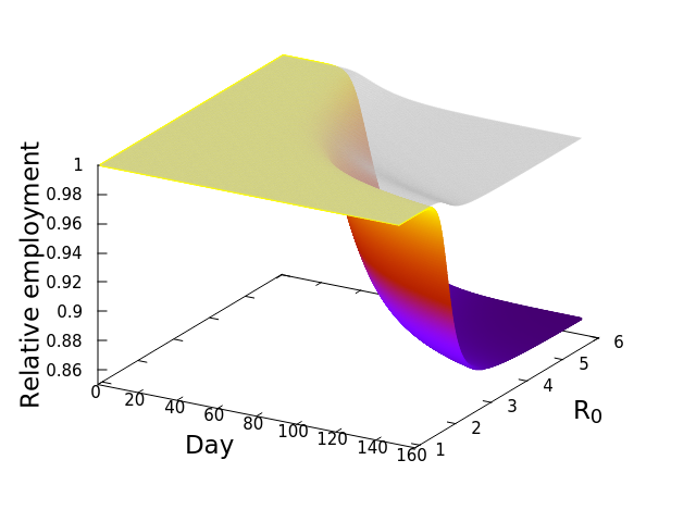
Now, here’s where it gets really interesting. Let’s repeat that exercise, but this time with a different SES, Fresno. Everyone knows Los Angeles, but Fresno might be a bit less known to some readers. Fresno is a city in the central valley of California, much smaller in population size compared to Los Angeles (542,252 vs. 3,898,767 in April, 2020), and dominated by a goods producing economy. This second plot shows the simulation result for Fresno. Notice how much steeper the decline of employment is in comparison to the Los Angeles SES! Whereas the LA surface or employment dipped to around 94%, Fresno’s decline is down to 86%, suggesting a more severe impact of the open economy, or as we termed it, the “business-as-usual” policy. And this decline occurs despite the grey, disease-only surface seemingly no worse than that for LA.
The implication is that the economic cascade that would result from maintaining an open economy during COVID-19 in 2020 would have had more severe consequences for Fresno than it would have for LA. In the next post we will compare the results for all the California SESs, and explore the features of those socioeconomic systems driving the differences. Before that, however, I’ll leave you with this nifty alternative graphic of the simulation results. These plots, that look like wedges of cheese to me, are simply “fill-ins” of the gap between disease-only driven unemployment, and that driver plus the economic cascade. Lining up LA and Fresno side by side allows me to appreciate how differently the two SESs are predicted to respond. In the next post we’ll look at the cheese wedges for all the SESs, and compare them across the state.
In the last post we developed a network model of a typical American socioeconomic system (SES), and added dynamics to it in the form of differential equations. Those equations reflect the flow of economic goods and services (inputs and outputs) within and between all the industrial sectors in the network. Now this is very important: the model’s initial condition of the SES is one of equilibrium, i.e. all the flows are balanced, so that each sector or node in the network is stable regarding the number of persons employed in the sector. In other words, when we set the system into motion, it remains static. That system is boring (in a healthy sense), and a plot of any measure of economic health over time is simply a flat line (again in a healthy sense). And it will remain in this state in the absence of disease.
Disease outbreak
We can now make a qualitative prediction of the outcome of an outbreak of COVID-19 in the SES: some workers will become infected, some of those workers will either become too ill to remain employed, or will die, the demand for “raw” materials in that sector might fall (output certainly would), and the effects of the outbreak in that particular sector would therefore be transmitted, or cascade, to all other sectors. The sector would, at the same time, feel the impact of outbreaks in other sectors, as there would be multiple feedbacks generated in the system. This qualitative assessment leaves many questions unanswered though, and those questions get to the heart of why we set out on this investigation in the first place: How devastating would the economic downturn be if no action is taken to curb spread of the disease by shuttering the economy? The feedbacks complicate any simplistic attempt to answer the question, because there are both positive and negative feedbacks in motion. For example, a positive, or reinforcing feedback, will occur between two sectors that depend on each other; losses of workers to disease in each sector cause economic losses in the other sector, which in turn drives further losses in the first sector, and so on. A negative or dampening feedback would be the spread of the disease itself, which depends on transmission between infectious and susceptible individuals; the spread slows down as the number of susceptible persons–those who have not yet been infected–decreases, and hence contact becomes less probable.
Addressing the main question requires us to get quantitative, because we have to consider several important influencing factors, namely: 1. How intense is the outbreak? That is, at what rate is it spreading? 2. How many people are employed in the SES, and how are they divided up among the various sectors? 3. How healthy is the workforce, that is, how susceptible is it to the outbreak?
The answer to the first question is central to the study of communicable diseases, and great effort is put into estimating the rate of infection of any such disease. In the first post of this series we touched upon the basic SIR (Susceptible, Infected, Removed) model and showed that the increase in the number of infected/infectious persons is nonlinear, first accelerating with time, and then declining. To understand this, imagine that you are in a zombie apocalypse movie. Everyone knows that the zombification rate depends on the number of zombies: the greater the number of zombies, the faster the rate at which the number of zombies grow. In a real disease, both the number of suseptible and the number of infected persons will eventually decline, as susceptibles become infected and infected persons either recover, or do not. The figure at left illustrates this, showing an initial increase in the number of infected persons, with a peak, and then a slow decline.
We can apply this model easily to an SES if we have an initial rate of infection and an estimate of the number of people initially infected. We can also make our model a bit more nuanced by focusing on one feature of COVID-19 for which we had relevant demographic data, and that is the disease’s more severe impact on older persons. What that means for our model is that the impact on the labour force depends on the age structure of that sector, in that SES. And we incorporated that information into our model by breaking down each SES sector into four age categories, 5-17, 18-49, 50-64 and 65 years and over, and using the US CDC’s (Center for Disease Control) estimates of the rates of severe illness and fatality in each category.
Provisional COVID-19–Related Mortality Rates by Age Group and the Predominant Variant Period, United States, Weeks Ending January 4, 2020–October 1, 2022. (US CDC)
If you recall from the previous post, the dynamic model for each SES sector was written as
And now we make that a bit uglier by showing that
where n is one of our age sectors. All this equation says is that the rate of change of employees in a sector is a function of the rate, , at which workers are removed from the workforce (summed over all 15 sectors and 4 age categories). And that we measured as,
where d and h are death and hospitalization rates (again obtained from the CDC) for age category n, and |n| is the current size of or number of workers in n. N is the total size of the sector. What about R? Think of R for now as the estimated transmission rate. If R is greater than one, then it means that each infected/infectious person will spread the disease to at least one other person, probably more. If R is less than one, the disease dies out.
Perhaps the best way to show how this all works is to simulate it for an actual sector. Shown in these plots is the impact of the actual outbreak in March 2020, in San Francisco, for the Leisure and Hospitality sector (e.g. the hotel industry). We modeled the first 100 days of the outbreak, with an initial basic reproduction number, or R0, of 1.5. This value was derived from numerous data and model sources at the time that were being actively compiled by the California Department of Public Health’s California COVID Assessment Tool (CalCAT). Take a look at the plots below. The plot on the left shows the results of the SIR model, and the corresponding loss of employees in the sector during the same time period is shown in the plot on the right. Note the nonlinearity of the response: there is initially very little impact, but the acceleration is rapid as infection in the population ramps up. Things eventually settle down as the disease runs its course through the population. Importantly, the reduction of the number of employees is not a one to one match with the disease, and you can see this by comparing the Susceptible curve on the left, to the employment curve on the right. The lack of correspondence is driven by the fact that employment depends not only on illness in the Leisure and Hospitality sector, but also illness and changes of employment levels (and hence productivity and demand) in all the other sectors.
Finally, we can break this result down and examine each age category individually. We see immediately the uneven impact of the disease across age brackets, a result all too familiar as we witnessed the terrible impact that the pandemic has had on older people. The projected losses of employment for those 65 and older in the Leisure and Hospitality sector would be greater than 30%, even though they comprised only 7.7% of people employed in the sector.
In the next post we will look more broadly at the ten Californian SESs, and whereas here we looked at the impact on different age groups, next we will examine the impact on economies of different sizes and structure.
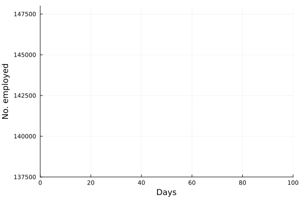
There is a common saying among scientists that goes something like this: “All models are wrong, but some are useful”1, or “…but some are less wrong than others” and so on, you get the point. I prefer, however, the title of this post, “All Models are Lies”, which I have shamelessly paraphrased (stolen) from the mathematician Eugenia Cheng, who has said that “all equations are lies” (and demonstrates the truth of that statement beautifully). Both statements are absolutely correct, in my opinion, when we interpret models or equations as representations of some aspect of reality; but that doesn’t mean that they are wrong, it simply means that we must be aware of the decisions that have been made when constructing the representations. Take for example the logistic equation as used to represent the growth of a biological population
EQ. 1: (POPULATION GROWTH RATE) = (INTRINSIC RATE OF INCREASE) x (POPULATION SIZE) x (GROWTH REGULATION)
Logistic growth. Population size is limited by carrying capacity, growing to that limit and remaining there. X(0) = 1, r = 1 and K = 100. That is, the environment can sustain up to 100 individuals of the species.
I derived and explained this equation, or model, in an earlier post. X is the size of the population, and dX/dt then is the growth rate, or the change of X as time passes. Logistic growth describes a pattern where the population grows very quickly when there are only a few individuals and therefore plenty of unused resources, but growth slows down as the population nears a level at which resources are becoming increasingly limited, and factors related to crowding can become an issue. This is a reasonably accurate description of how populations of organisms can grow, and as such the model describes the growth of population X with precision. BUT, X is not actually a population of actual organisms, it’s just a variable, and as such the equation is a lie; unless we choose to represent such a population with X. In doing so we are deciding explicitly to focus on the growth of the population as captured by the few variables in our equation, discarding many details that are either deemed irrelevant to that focus or that have minimal effects, or that are simply too difficult to incorporate into the current model. The inclusion of those details becomes increasingly difficult as the number of details to be considered increases, precision is elusive, and the result is more often than not a mathematical mess. The logistic equation is very useful, but we should never forget the fact that it is describing the growth of X, and that is useful to say an ecologist, only if and when we decide that X represents some aspect of the population of a biological species.
This is a bit of a conundrum in the world of complex systems, such as ecological or socioeconomic systems that involve numerous different players and masses of interactions. We can approach the problem with an extreme reduction of complexity, as in the example above, or as is possible with many physical systems. Let’s face it, throwing a ball and describing its dynamics with Newton’s laws of motion (simple equations) works great because we can usually ignore features like the surface texture of the ball or wind speed. Or we can approach things from the other direction and throw the kitchen sink at the problem and attempt to combine as many variables as can be measured and that might be involved in the system. For complex systems, perhaps the most reasonable approach is to find a point somewhere between these extremes where one can mobilize enough features that both describe the system sufficiently to yield some sense of realism, and that can be modeled reliably.
And I confess that this lengthy preamble is really intended to convince you of why we decided to model Californian socioeconomic systems (SESs) during the COVID-19 pandemic in the way that we did, and now that you’ve been convinced, let’s dive into the model. What we propose as our model is that an SES will remain unchanged in the absence of a COVID-19 outbreak.
The SES Model
Let’s look again at our network representation of the major industrial sectors in the typical SES, described in the previous post. All the sectors are connected because there are economic exchanges between them. Notice that the arrows linking sectors have different thicknesses. That is our graphical representation of the fact that the strength of the exchanges vary, with thicker arrows meaning that the recipient of goods or services (the direction of the arrow) is quite dependent on the donor. For example, many sectors depend heavily on Manufacturing, and hence there are many thick arrows flowing out of that sector. The flow of materials or money along those links, however, also depends on how much the donor sector (network node) is capable of producing and the demand from the recipient sector, and in our model we decided that both those factors are determined by the number of employees in each sector. In other words, if the Financial sector receives goods from Manufacturing, then the flow of goods depends on the ability of Manufacturing to produce those goods, and the demand from the Financial sector, and both of those depend on the number of labourers producing and demanding.
Our goal was to examine the effect that the pandemic would have on the network as the disease spread among workers in the sectors. In order to do that, we first had to bring our network to life, and we did that with the following bit of mathematics. First, we assumed that the growth rate of a sector, that is, the number of employees in the sector, is a function of the economic demands both within that sector, and from all other sectors in the SES network. Those demands in turn depend on both sector employment levels, as well as the strength or value of the exchanges between sectors. Second, we modeled the outbreak of COVID-19 in the general population of the SES, and applied that to each sector. Let’s break this down into steps and derive the model.
Let’s assume that a sector, i, is independent of all the others, and that workers in the sector suffer an outbreak of disease. Then the growth rate of the sector may be expressed simply as
EQ. 2: RATE OF CHANGE OF EMPLOYEES = (RATE OF EMPLOYEES LOST TO DISEASE) x (NO. OF EMPLOYEES)
where is the number of employees in i, and is the rate at which workers are being lost–in that sector. We assume that workers are lost either to fatality, or because they suffer severe illness and are no longer able to work. We also assume that no new employees are being added, which was largely true at the beginning of the lockdowns, and therefore that the growth rate is always zero (if there is no disease then ) or negative ().
This is straightforward enough, but we want to capture the network by adding the interactions and inter-dependencies with the other sectors to our equation. We do that by first figuring out how much each interaction is worth, and that we did using something known as the “industry by industry total requirement” or input-output exchanges, which is kindly provided to us by the United States by the US Bureau of Economic Analysis (yet another good use of taxes employing government workers!). We then weighted each interaction (network arrow) by how much it was worth relative to the total interactions or exchanges for a sector. The dependency of sector i on sector j can now be expressed as the sum of what i provides to j, and what j provides to i.
EQ. 3: RATE OF CHANGE OF EMPLOYEES = (RATE OF EMPLOYEES LOST TO DISEASE) x (NO. OF EMPLOYEES) x (INPUT-OUPUT EXCHANGES WITH SECTOR j)
where is the relative weight of the flow from i to j ( refers to exchanges within sector i itself). The value of the exchange is this weight multiplied by the number of employees in sector j at time t () relative to the original number of employees (at time 0).
Whew! I know that this is a mouthful, but there is one final step, and that is to sum the above exchanges over all the sectors in the SES network, which gives us this somewhat scary formula.
EQ. 4: RATE OF CHANGE OF EMPLOYEES = (RATE OF EMPLOYEES LOST TO DISEASE) x (NO. OF EMPLOYEES) x (THE SUM OF ALL INPUT-OUPUT EXCHANGES WITH SECTOR i)
Thankfully, with a little algebra we can simplify it to
where represents the value of exchanges between sectors. Really, all the equation says is: THE SOCIOECONOMIC SYSTEM WILL REMAIN IN EQUILIBRIUM UNLESS WORKERS ARE REMOVED FROM ANY SECTOR BECAUSE OF ILLNESS OR DEATH. This should be obvious, because in the absence of COVID-19, , so everything on the right hand side of the equation will also be zero, and therefore the rate of change of workers employed in sector i will also be zero. A static system.
If the notion of a static economic system appears to be a bit unreal, that’s because it is. This bothered several economists who reviewed our paper, but I would argue that they were missing the point of both a useful mathematical model, as well as the counterfactual basis of our model. We could introduce a bit of numerical noise to mimic fluctuations in the market, consumer activity and so on, but we are assuming that those average out on the short-term, and would add unnecessary complications to the analysis. Remember that the goal of the model is to address the question of what would have happened if an SES was allowed to continue operating without any economic shutdown. In the next post we will develop a way to do precisely this, by poking the system with simulated outbreaks of COVID-19.
1Attributed to the accomplished 20th century statistician, George Box. I hesitated to cite him, as I am uncertain if Box subscribed to the eugenics movement prevalent among many British and American statisticians of the era. I simply don’t know, but I do know that he was the son-in-law of Ronald Fisher, one of the century’s most accomplished statisticians, and also a notorious eugenist. Box also made reference in his own work to papers published in the discredited Annals of Eugenics (to which I will not provide a link).
WHAT IS ECOLOGICAL STABILITY? In 2019 I posed this question informally to colleagues, using Twitter, a professional workshop that I lead, and a conference. Respondents on Twitter consisted mostly of ecological scientists, but the workshop included paleontologists, biologists, physicists, applied mathematicians, and an array of social scientists, including sociologists, anthropologists, economists, archaeologists, political scientists, historians and others. And this happened…
In the previous post, we discussed the dramatic decline of the Atlantic cod (Gadus morhua) off Newfoundland over the past 60 years. I left us with the question of why, given the very limited catch sizes since the 1990’s, there was little evidence of population recovery (at least up until 2005). An Allee effect is a likely explanation for the failure of the population to recover during that extended period of reduced fishing pressure.
Beginning around 1994, the population may have become limited by an Allee phenomenon, or more appropriately mechanism, where a population’s size is limited far below the presumed carrying capacity, or observed maximum population size, because of reduced population size itself. Analogous to carrying capacity, where an upper limit is set on population growth rate by the effects of a relatively large population size, an Allee effect is an upper limit set by relatively small population size. Intuitive examples are easy to find, e.g. (1) species that require sufficient numbers for successful defense against predators will be increasingly limited by predation at low population size; (2) species for which habitat engineering by a sufficient number of individuals is necessary for offspring success; (3) species that depend on a minimum number of participants for the formation of successful mating assemblages. G. morhua, in which individual fecundity increases with age and body size (to a limit) (Fudge and Rose, 2008), is known to form, or have formed, large pelagic assemblages during spawning. Allee effects, therefore, describe situations where individual fitness depends on the presence of conspecifics, and is positively correlated with population size.
One vulnerability of populations subject to Allee effects is that small population size becomes an inescapable trap, with the likelihood of extinction increasing as population size declines. The reasons for this are twofold. First, if growth rates decline to zero or even become negative below an Allee threshold, then the state of zero population size becomes a stable state and extinction is assured. If you recall, our earlier models of population growth considered X= 0 (extinction) to be an unstable steady state; unstable because the addition of reproducing individuals to the population would result in divergence away from the zero state —population growth. Second, even if growth rate never becomes negative below the Allee threshold, a sufficiently large or sustained decline of population size increases the probability of extinction due to random events, a phenomenon termed stochastic extinction. Stochastic extinction, the probability of which could increase with deteriorating environmental conditions, is of interest to anyone studying extinction, including paleontologists, and will be discussed in a later section. Here, however, we will first explore several simple models of Allee effects.
Models of Allee effects
In the logistic model (Eq. 1 here), mortality rate increases as population size, X, approaches carrying capacity K, and population growth rate subsequently declines. The logistic model has two alternative steady states, X=K and X= 0, the latter of which is unstable as discussed above. The extinct state is a stable attractor, however, in the presence of an Allee effect. There are several simple models that demonstrate the effect, but to appreciate them, and the Allee effect itself, let us first examine the relationship between population size and growth rate under the logistic model. If we plot growth rate (dX/dt) against population size in the logistic model (Fig. 1), we see that the rate increases steadily at small population size, reaches a maximum when population size is half of the carrying capacity —X(t) =K/2— and declines steadily thereafter, reaching zero at carrying capacity. This value can be arrived at analytically because what we are visualizing is the rate of change of growth rate itself, technically the second derivative of the logistic growth equation. If we expand the logistic growth rate equation and take the derivative, we derive the acceleration (or deceleration) of the rate of change of population size as a function of population size itself. Setting d2X/dt equal to zero —the point at which growth rate is neither accelerating nor decelerating— we get the maximum that is illustrated in Fig. 1. The important thing to note here is that growth rate is always positive when 0<X(t)<K, that is, when population size lies between zero and the carrying capacity.
Fig. 1: The relationship between population growth rate and population size under a logistic model. In this example carrying capacity K=100.
There are several ways in which an Allee effect can be modelled in a logistically growing population. For example, if the Allee threshold is represented as a specific population size A, then the effect can be incorporated into the logistic formula as (Lewis and Kareiva, 1993; Boukal and Berec, 2002). The first term on the RHS of the equation is the logistic function, where growth declines to zero as X approaches K. The second term introduces the threshold, A, with growth rate declining if X < A, and increasing when X > A. Here, the effect is treated as the difference between population size and the threshold, taken as a fraction of carrying capacity, or maximum population size. Note that if A=0 —there is no Allee effect— the model reduces to the logistic growth model. A more nuanced model, where A must be greater than zero —an Allee effect always exists— treats the Allee threshold as equivalent yet opposite to K, representing a lower bound on growth rate (Courchamp et al., 1999). If A=1 —in which a population comprising a single individual is compromised under all circumstances— then the strength of the Allee effect depends on the size of the population. In both models, growth rate becomes negative below the threshold A, effectively dooming the population to extinction (Fig. 2). This condition is often termed a “strong” Allee effect.
Negative growth rates, a feature that is common to many models of the Allee effect, can be somewhat problematic from a conceptual viewpoint because of their determinism. We’ll pick this point up in the next post, and also discuss why paleontologists might care about both Allee effects, and model determinism.
Fig. 2: Two models of strong Allee effects illustrates as plots of population growth rate vs. population size. K=100. Red shows the first model where growth rate is relative to the Allee threshold A as a function of K. Blue shows the second model where growth rate is relative to the threshold A itself.
Vocabulary Allee effect — A positive correlation between individual fitness, or population growth rate, and population size. This means that fitness and/or growth rates decrease with declining population size. Second derivative — The derivative of a function’s derivative (the first derivative), thus the acceleration (deceleration) of a rate. E.g. the first derivative of a body in motion, described by position and time, is velocity or speed. The second derivative is acceleration, or the rate at which the speed is changing. Stochastic extinction — A relationship between the probability of a population’s extinction, and population size and/or environmental variability. In general, the risk of extinction increases due to random fluctuations of either factor. Strong Allee effect — Population growth rate becomes negative below some threshold of population size.
References Boukal, D. S. and Berec, L. (2002). Single-species models of the Allee effect: extinction boundaries, sex ratios and mate encounters. Journal of Theoretical Biology, 218(3):375–394. Courchamp, F., Clutton-Brock, T., and Grenfell, B. (1999). Inverse density dependence and the Allee effect. Trends in Ecology & Evolution, 14(10):405–410 Fudge, S. B. and Rose, G. A. (2008). Changes in fecundity in a stressed population: Northern cod (Gadus morhua) off Newfoundland. Resiliency of gadid stocks to fishing and climate change. Alaska Sea Grant, University of Alaska Fairbanks. Lewis, M. and Kareiva, P. (1993). Allee dynamics and the spread of invading organisms.Theoretical Population Biology, 43(2):141–158
Yesterday I gave a talk for the “Breakfast Club” series at the Academy (California Academy of Sciences). The club is a twice weekly series of online talks started by the Academy in response to the widespread shelter-in-place and shutdown orders. It’s intended to bring a bit of our science and other activities to those interested who, like so many of us, find ourselves mostly limited these days to online interaction.
My talk focused on some new work that we are doing in the lab, related to the COVID-19 pandemic, but inspired by and built partly on our paleoecological and modelling work. I hope that you find it interesting! Oh, and while you’re there, check out the other talks in the series (link above)!
WHAT IS ECOLOGICAL STABILITY? In 2019 I posed this question informally to colleagues, using Twitter, a professional workshop that I lead, and a conference. Respondents on Twitter consisted mostly of ecological scientists, but the workshop included paleontologists, biologists, physicists, applied mathematicians, and an array of social scientists, including sociologists, anthropologists, economists, archaeologists, political scientists, historians and others. And this happened…
The logistic equation, covered in the previous post, is a differential equation, where time is divided up into infinitesimal bits to model the growth and size of X (“infinitesimal” knots your stomach? I cannot recommend Steven Strogatz’s “Infinite Powers” enough!). We can also simulate the logistic model in discrete time to get a better feeling for it, where X(t + 1) is population size in the next “time step” or generation. This approach is instructive because anyone can play with the calculations using a calculator or spreadsheet! Here is an example of a discrete version of logistic growth, the Ricker difference equation (Ricker, 1954).
EQ. 1: (FUTURE POPULATION SIZE) = (CURRENT POPULATION SIZE) x (EXPONENTIAL REPRODUCTION LIMITED BY CARRYING CAPACITY AS IN THE LOGISTIC MODEL)
r has been replaced by R, the main difference between the logistic equation and Eq. 1 being that, because we no longer measure time as continuous but instead step discretely from one generation to the next, we measure the intrinsic rate of increase as the “net population replacement rate”. The population again, after an initial interval of near-exponential growth, settles down to a fixed value at K (Fig. 1). Both the continuous and discrete logistic patterns of population growth are, by all definitions, stable populations in equilibrium. They are stable because, at least within the scope of the models, once a population attains its carrying capacity there is no more variation of population size. This brings us to our first definition of stability.
Stability: An absence of change.
Discrete time logistic growth, showing population sizes per discrete generation. X(0) = 1 and K = 100. R = 1.0.
In the following sections we will cover a real-world example of logistic growth, and then go through the derivation of the logistic function itself.
An Example of Logistic Growth
The state of Washington in the United States employed a program of harbor seal (Phoca vitulina) culling during the first half of the twentieth century. The seals were considered to be direct competitors to commercial and sport fishermen. The state sponsored monetary bounties for the killing of seals until 1960, by which time seal populations must have been reduced significantly below historical levels. Additional relief arrived for the seals in 1972 with passage of the United States Marine Mammal Protection Act. Monitoring of seal populations along the coast, estuaries and inlets of Washington, primarily by the Washington Department of Fish and Wildlife, and the National Marine Mammal Laboratory provided a time series of seal population size, spanning the beginning of recovery in the 1970’s to the end of the century (Jeffries et al., 2003). Population sizes from one region of the coastal stock, the “Coastal Estuaries”, show a logistic pattern of growth (Fig. 2). The function fitted to the data (using a nonlinear least squares regression) is y = 7511.541/[1 + exp[−0.265(x − 1980.63)]] (r-squared = 0.98; p < 0.0001; note that “r-squared” is the coefficient of correlation, not our intrinsic rate of increase). Given an initial population size of X(0) = 1,694 in year 1975, the function yields estimates of r = 0.265 and K = 7,511. This excellent example of logistic growth in the wild, or recovery in this case, was unfortunately brought to us courtesy of the ill-informed belief that the success of human commercial pursuits necessitate, or even benefit from, the destruction of wild species.
Logistic recovery of a harbor seal (Phoca vitulina) population in Washington state, U.S.A., after the cessation of culling and passing of the Marine Mammal Protection Act. Orange circles are observed population sizes, the blue line is the fitted logistic curve, and the red horizontal line is the estimate carrying capacity.
Deriving the logistic equation Equation 1 in the previous post is the logistic growth rate of the population, but it is not the logistic function itself. That function is obtained by integrating the growth rate dX/dt, and the process is instructive because, as illustrated in later sections, our ability to do so with more complicated dynamic equations is quite limited.
The logistic growth rate is first re-written to eliminate the X/K ratio (makes it easier to proceed) and then re-arranged to separate variables, The logistic function is derived by integrating both sides, but doing so with the left hand side (LHS) requires simplification using partial fractions (some of you might remember those from high school math; or not). The solutions to the final equation are A=1 and B-A=0, yielding B=1. Therefore Now if we wish to integrate our logistic differential equation, , we can substitute our partial fractions solution and proceed as follows. And if you recall our integration of the Malthusian Equation, the solution is Let , a constant. Then which is the equation for logistic population growth! Whew.
References Jeffries, S., Huber, H., Calambokidis, J., and Laake, J. (2003). Trends and status of harbor seals in Washington State: 1978-1999. The Journal of Wildlife Management, 67:207–218. Ricker, W. E. (1954). Stock and recruitment. Journal of the Fisheries Board of Canada, 11:559–623.
Four patches of trees in a forest. Time is shown on the x-axis, and relative population size on the y-axis. The local patch populations are often prevented from reaching carrying capacity, or staying there, but frequent forest fires.
Myself and several colleagues at the Academy have been working with scientists at the United States Forest Service, exploring how resilience may be maintained in forests of the Sierra Nevada in the coming century. The major concern is fire and its management. The natural regime of the Sierra Nevada is one of frequent fire, promoted by highly seasonal precipitation (intensely wet winters, very dry the rest of the year), thus with many fires during a year. The high frequency of fires would maintain a sparser density of trees, and fuel accumulation would be regulated by regular burning. The first human residents of the Sierra Nevada, Native American peoples, utilized natural resources in the Sierra Nevada, and developed a system of management using frequent fires, thus maintaining to a great extent the pre-anthropogenic regime. In later historic times, however, beginning in the late 19th century, fire management was implemented in various forms and levels in the interest of the timber industry, as well as the mining and expanding high elevation communities. Significant deforestation was replaced in many areas by increasing tree densities driven by fire suppression, conservation and re-planting efforts. Unfortunately, the result has been unnaturally high tree densities in many areas of the Sierra Nevada, and the dangerous accumulation of fuels. This is a common problem throughout forested areas of the United States, and one of the dangerous outcomes are fires of sizes and intensities well beyond what would be natural for the forest systems. California is at high risk because of the extent of its montane forested regions, its seasonal precipitation, drying and drought due to climate change (global warming), and extensive human use of the forests. The USFS and other agencies, as well as residents, communities and industries, are therefore engaged in developing strategies to maintain resilience of the forests, and sustainable use of forest resources. Academy scientists have become involved both as advisors about communication and education efforts, as well as working on the ecology of the system.
Forest growth under fire suppression. Note the lower frequency of burns, but the larger loss of trees.
One of the first steps that we took was to begin work on a simple conceptual model of tree growth, fuel and fire dynamics based on ordinary differential equations. Most recently I’ve been translating the model into a tractable system of difference equations for simulation on a landscape. The model is still too preliminary to get into much detail here (and not yet peer reviewed), but here are some cool visualizations. The plot at the top of the post shows a landscape of four forest patches. Each patch consists of reproducing trees. Patches may export a small fraction of seedlings to neighbouring patches, including out into nothingness (tree bare patches), and will eventually asymptote density-dependently to a stable equilibrium (based on a standardized carrying capacity of 1). Trees also produce fuel, which accumulates unless a fire is ignited, at which point a large fraction of the fuel is lost. At each time step, trees reproduce and produce fuel, and there is a probability of fire. The top plot shows the forest (and individual patches), where the probability of ignition is fairly high, mimicking pre-historic conditions. The “jaggedness” of the population trajectories indicate fires and recovery. This second plot is the same forest, but this time with a much lower incidence of fire, corresponding to a modern regime of fire suppression. Notice the lower frequency of burns, but when they do occur they are larger and losses of trees are greater. These would correspond to our unfortunate current megafires.
Finally, the latest bit of work has been to scale the model up, and here are the results of two 10×10 forest grids run for 500 years (with the first 100 years discarded as transient burn in) (see the YouTube links below). “Greener” indicates higher tree density, and yellow indicate lower densities. The main thing to get from these is that the landscape is overall greener when the incidence of fire is lower, that when fires occur in that regime they are indicated by the immediate appearance of bright yellow patches of tree loss, and that there is a more moderate density of trees in the high fire landscape, and correspondingly greater frequency of smaller fires. That’s pretty much it for now, but working on this has been a lot of fun so far, and who doesn’t like nice visualizations?! (If you don’t like them, feel free to comment…)
Modeled ecological dynamics in South Africa 1 million years after the end Permian mass extinction, showing the highly uncertain response of the community to varying losses of primary production.
We have a new paper on paleo-food web dynamics in the Journal of Vertebrate Paleontology! The paper is one in a collection of 13 (and 27 authors), all focused on the “Vertebrate and Climatic Evolution in the Triassic Rift Basins of Tanzania and Zambia”. The collection covers work done in the Luangwa and Ruhuhu Basins of Zambia and Tanzania, surveying the vertebrates who lived there during the Middle Triassic, approximately 245 million years ago (mya). This is a very interesting period in the Earth’s history, being only a few million years after the devastating end Permian mass extinction (251 mya). They are also very interesting places, capturing some of our earliest evidence of the rise of the reptilian groups which would go on to dominate the terrestrial environment for the next 179 million years. The evidence includes Teleocrater, one of the earliest members of the evolutionary group that includes dinosaurs and modern birds.
Our paper, “Comparative Ecological Dynamics Of Permian-Triassic Communities From The Karoo, Luangwa And Ruhuhu Basins Of Southern Africa” is exactly that, a comparison of the ecological communities of southern Africa before, during and after the mass extinction. Most of our knowledge of how the terrestrial world was affected by, and recovered from the mass extinction comes for extensive work on the excellent fossil record in the Karoo Basin of South Africa, but that leaves us wondering how applicable that knowledge is to the rest of the world. We therefore set out to discover how similar or varied the ecosystems were over this large region, comparing both the functional structures (what were the ecological roles and ecosystem functions) and modeling ecological dynamics across the relevant times and spaces of southern Africa. We discovered that during the late Permian, before the extinction, the three regions (South Africa, Tanzania, Zambia) were very similar. In the years leading up to the extinction, however, communities in South Africa were changing, becoming more robust to disturbances, but the change seemed slower to happen further to the north. The record becomes silent during the mass extinction, and for millions of years afterward, but when it does pick up again in the Middle Triassic of Tanzania, the communities in South Africa and Tanzania are quite distinct in their composition. The ecosystem in South Africa was dominated by amphibians and ancient relatives of ours, whereas to the north we see the earliest evidence of the coming Age of Reptiles. Yet, and this is where modeling can become so cool, the two systems seemed to function quite similarly. We believe that this a result of how the regions recovered from the mass extinction. Evolutionarily, they took divergent paths, but the organization of new ecosystems under the conditions which prevailed after the mass extinction lead to two different sets of evolutionary players, in two different geographic regions, playing the same ecological game. As we say in the paper, “This implies that ecological recovery of the communities in both areas proceeded in a similar way, despite the different identities of the taxa involved, corroborating our hypothesis that there are taxon-independent norms of community assembly.”
A guild-level food web for the Karoo Basin ecosystem.
At the heart of our paper lies a model framework which we devised for analyzing fossil food webs. I stated in the previous post that our main question was “How would those food webs (important parts of the paleoecosystems) have responded to everyday types of disturbances, on the short-term, as the planet was busily falling apart?” We could approach this question in several different ways if we were working with modern food webs. We could conduct manipulative experiments with simple mock-ups of the food web, using for example some of what we believe to be the key species to represent the community. Or, we could conduct large scale manipulations, such as removing a species entirely; but that is very difficult to do, or to obtain permission! Or, we could measure variables such as species population sizes, how species interact with each other, and so forth, to then conduct numerical analyses and simulations. None of those approaches are available to us when dealing with ancient, extinct ecosystems. Therefore, what we did instead was to use the most accurate information that we have for each paleoecosystem, which consisted of categorizing species into “guilds”. Here, a guild is a group of species who shared the same habitat, and potentially shared the same predators and prey. The “potentially” is based on our best interpretations of the ecologies of those extinct species, because without actually being there to witness their interactions (back to that Tardis again), we cannot be sure. The result is usually something like the box figure above. Even with species lumped, you can see how complex and busy the system would have been! And from this guild-level model, we can then construct many many different food webs, tweaking the specific links between species. An example is shown in the second figure.
Now, the number of different food webs that you could generate based on even a modest number of species, say 20, and a few guilds, is astronomically large (in fact beyond astronomical). The important thing, however, is that all of them would be consistent with the guild scheme. Let me give an example. Say we did a guild scheme for the modern African savannah. We would be justified to some extent to place lions and hyaenas in the same guild. We might not know exactly which antelope species (for example) each predator species was preying on, but we would never draw a food web where antelope were preying on lions, hyaenas or each other! So, what we have done for our food webs is constructed a mathematical space that contains all the food webs which could possibly have existed in our paleoecosystem. In other words, we have taken the full set of food webs that could be constructed for a certain number of species, and constrained ourselves to consider only those that are consistent with our accurate knowledge of the guild structure.
Detail of one possible food web just prior to the mass extinction.
This still doesn’t solve the problem of how those food webs would have responded to various types of disturbances in the distant past. And in fact, we really cannot solve that problem, so we did what we think is the next best thing. We asked if there was anything special about those food webs, compared to any others that were not consistent with our guild structure. In other words, what if the ecosystem had evolved a bit differently, and comprised species a bit different from what we actually observe in the fossil record? We considered a number of such alternative models, differing from the real ecosystem in ways such as moving species around in the guilds, or moving guilds and the interactions between them, or removing guilds altogether. And each time we did that, and generated a food web from the new guild scheme, we examined the stability of the food web. Exactly what we mean by stability, and how we measured it, will be the subject of the next post.


 in the
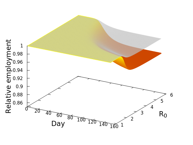


![\frac{dE_i^*}{dt} = -\phi_iE_i^*\left [w_{ii} + \left (\sum_{j=1}^S \mu_{ij}E_j^*\right )\right ]](https://s0.wp.com/latex.php?latex=%5Cfrac%7BdE_i%5E%2A%7D%7Bdt%7D+%3D+-%5Cphi_iE_i%5E%2A%5Cleft+%5Bw_%7Bii%7D+%2B+%5Cleft+%28%5Csum_%7Bj%3D1%7D%5ES+%5Cmu_%7Bij%7DE_j%5E%2A%5Cright+%29%5Cright+%5D&bg=ffffff&fg=000&s=0&c=20201002)
 by showing that
![\frac{dE_i^*}{dt} = -\sum_{n=1}^4 \left [E_{i,n}^*\phi_{i,n}\left [w_{ii} + \sum_{j=1}^{15}\left (\mu_{ij}E_j^*\right )\right ]\right ]](https://s0.wp.com/latex.php?latex=%5Cfrac%7BdE_i%5E%2A%7D%7Bdt%7D+%3D+-%5Csum_%7Bn%3D1%7D%5E4+%5Cleft+%5BE_%7Bi%2Cn%7D%5E%2A%5Cphi_%7Bi%2Cn%7D%5Cleft+%5Bw_%7Bii%7D+%2B+%5Csum_%7Bj%3D1%7D%5E%7B15%7D%5Cleft+%28%5Cmu_%7Bij%7DE_j%5E%2A%5Cright+%29%5Cright+%5D%5Cright+%5D&bg=ffffff&fg=000&s=0&c=20201002)
 , at which workers are removed from the workforce (summed over all 15 sectors and 4 age categories). And that we measured as,


 is the number of employees in i, and
  is the rate at which workers are being lost–in that sector. We assume that workers are lost either to fatality, or because they suffer severe illness and are no longer able to work. We also assume that no new employees are being added, which was largely true at the beginning of the lockdowns, and therefore that the growth rate is always zero (if there is no disease then
  ) or negative (
 ).
).
 is the relative weight of the flow from i to j (
 refers to exchanges within sector i itself). The value of the exchange is this weight multiplied by the number of employees in sector j at time t (
 ) relative to the original number of employees (at time 0).
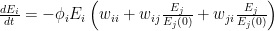
 ![\frac{dE_i}{dt} = -\phi_i E_i \left [ w_{ii} + \sum_{j=1}^{S}\left ( w_{ij}\frac{E_j}{E_j(0)} + w_{ji}\frac{E_j}{E_j(0)}\right ) \right ]](https://s0.wp.com/latex.php?latex=%5Cfrac%7BdE_i%7D%7Bdt%7D+%3D+-%5Cphi_i+E_i+%5Cleft+%5B+w_%7Bii%7D+%2B+%5Csum_%7Bj%3D1%7D%5E%7BS%7D%5Cleft+%28+w_%7Bij%7D%5Cfrac%7BE_j%7D%7BE_j%280%29%7D+%2B+w_%7Bji%7D%5Cfrac%7BE_j%7D%7BE_j%280%29%7D%5Cright+%29+%5Cright+%5D&bg=ffffff&fg=000&s=0&c=20201002)
 represents the value of exchanges between sectors. Really, all the equation says is: THE SOCIOECONOMIC SYSTEM WILL REMAIN IN EQUILIBRIUM UNLESS WORKERS ARE REMOVED FROM ANY SECTOR BECAUSE OF ILLNESS OR DEATH. This should be obvious, because in the absence of COVID-19,


![\Rightarrow K = X\left ( K-X\right ) \left [ \frac{A}{X} + \frac{B}{K-X} \right ]](https://s0.wp.com/latex.php?latex=%5CRightarrow+K+%3D+X%5Cleft+%28+K-X%5Cright+%29+%5Cleft+%5B+%5Cfrac%7BA%7D%7BX%7D+%2B+%5Cfrac%7BB%7D%7BK-X%7D+%5Cright+%5D&bg=ffffff&fg=000&s=0&c=20201002)


 ,
,


 , a constant. Then


