
Previous posts in this series:
1. COVID-19, Economics, Tipping Points – Part I
2. COVID-19, Economics, Tipping Points – Socioeconomic Networks
3. COVID-19, Economics, Tipping Points – All Models are Lies
4. COVID-19, Economics, Tipping Points – Simulating an Outbreak
Roopnarine, P. D., M. Abarca, D. Goodwin and J. Russack. 2023. Economic cascades, tipping points, and the costs of a business-as-usual approach to COVID-19. Frontiers in Physics. 11:1074704. doi: 10.3389/fphy.2023.1074704
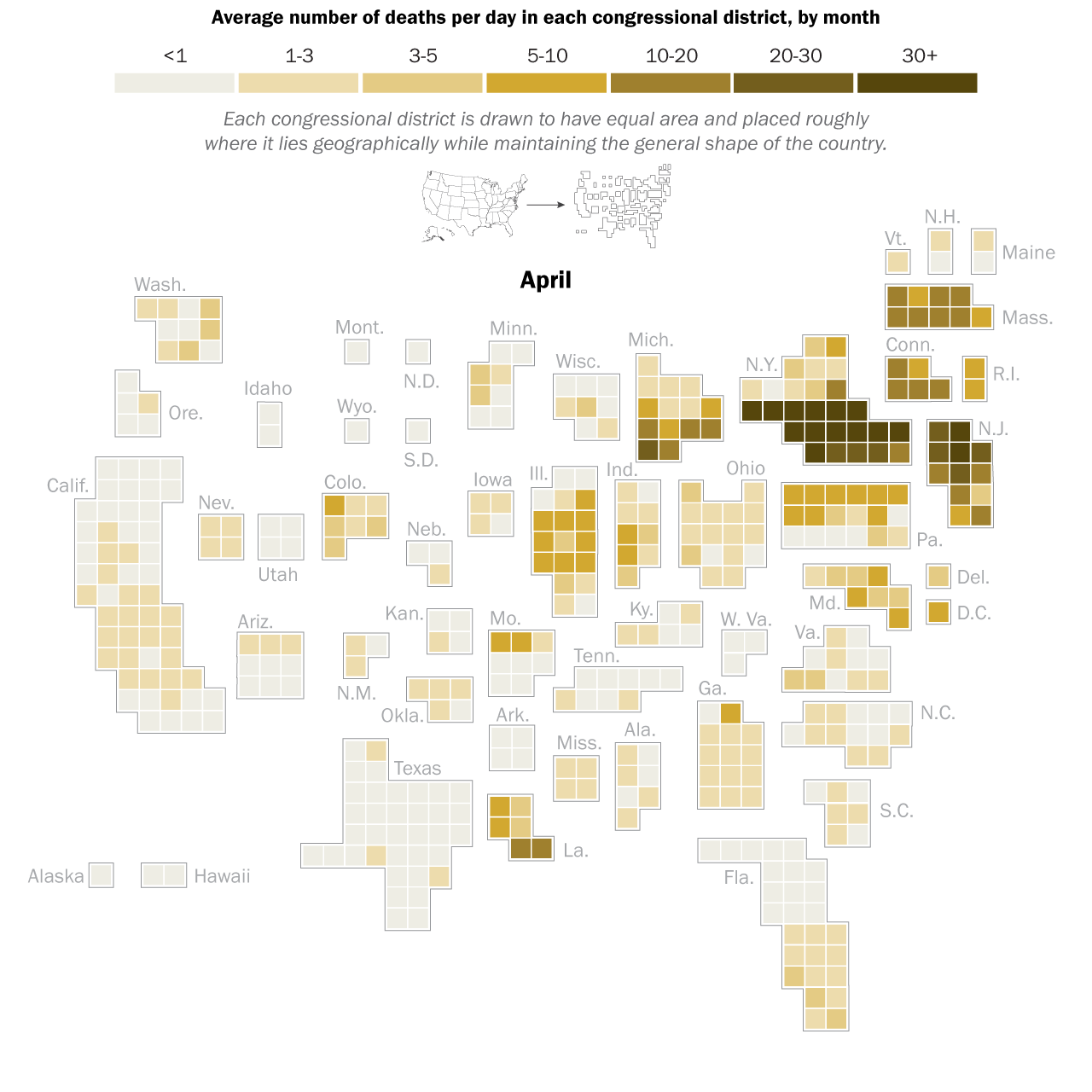
I had the great pleasure of giving a presentation last week about this COVID-19 and economics work to a very interesting research group, the ASPIRE (Adaptive Social, Psychological, and Information Response to Emergencies) Collaboratory. It’s a great group of very interesting people! Assembling the presentation really forced me to think about the entire narrative thread of what we did in our own study, and I was able to align the pieces better into a good storyline. In the previous blog post I explained the mathematical models underlying our counterfactual exploration, but the first interesting result did not actually come from the simulation of any particular SES (socioeconomic system) following outbreak of COVID-19 in early 2020, but actually from considering how an SES would respond to any sort of COVID-19 outbreak. What is “any sort” referring to? It means that early in 2020, the impact of COVID-19 varied greatly across societies and geography. Much of this variation can be tied to the timing of the disease’s arrival to a particular place. In general, the earlier the outbreak, the more severe were the consequences. This was true of the first hot spot in Europe, northern Italy, as it was of the first hot spot in the United States, New York City (see the graphic below). It must also have been true in Wuhan, the probable ground zero of COVID-19, and other large Chinese cities to where people would have traveled extensively before it was apparent that an epidemic was underway. All this variation created not only uncertainty about the nature of the disease, but also variation in the severity of initial outbreaks.
This uncertainty can be expressed as variation of the “infection rate”, the 
We were interested in the general question of how each SES would respond economically across a range of R0 values, given the counterfactual situation where the economies would remain open. To do this, we simply simulated the model (see this post), relating outbreaks of COVID-19 to losses of employment, for each SES at R0 ranging from 1.01-6, for 150 days. This would allow us to both see what the model predicts in general, as well as compare SESs. The results are best understood by looking at the following three dimensional plot. The axes at the base are your conventional x and y axes, with x representing the day of the simulation, and y the value of R0. The z or vertical axis shows the normalized level of employment in the SES, normalized meaning that a value of 1 represents the original employment level on March 1, 2020, and 0 meaning a complete loss of the workforce. The surface of the plot itself therefore shows the level of employment on any given day at any value of R0.
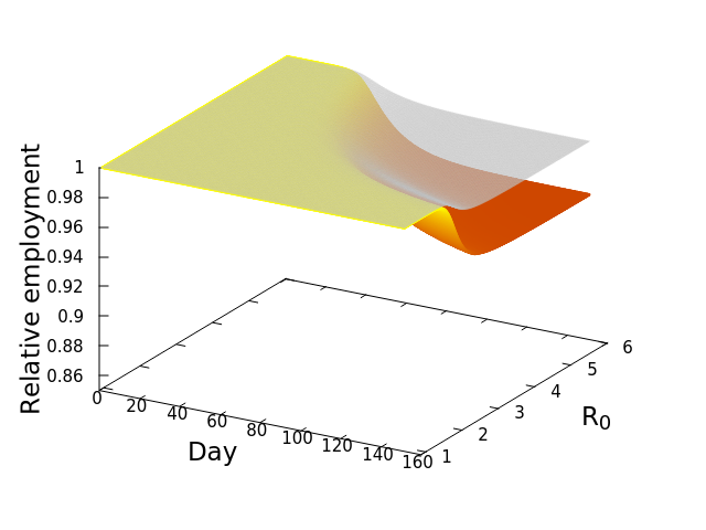
The figure here is for the Los Angeles-Glendale-Long Beach SES, and if you look closely you will see that there are actually two surfaces plotted. The upper transparent grey surface plots the fraction of employees lost directly to infection by COVID-19, which would result in either death or illness so severe as to lead to a loss of employment. Note that the surface is basically flat both early in time, and at low values of R0. However, as either time passes and the disease spreads, or the infection rate increases, or both, there is then a rapid decline of employment–that noticeable dip of the surface. It eventually levels off again as the disease has peaked. There is a second and lower surface, the colourful one. That surface shows the TOTAL loss of workers, that is, workers lost directly to infection (the grey surface), PLUS workers who subsequently lose their jobs because productivity and demand in their industrial sector, basically economic activity, are reduced by the diminished workforce. This is the economic cascade, and it will always be at least as severe as the disease-only cascade. This result therefore is the estimate that we have been seeking–the number of employees that would be lost as a consequence of maintaining an open economy during an outbreak of COVID-19.
Now, here’s where it gets really interesting. Let’s repeat that exercise, but this time with a different SES, Fresno. Everyone knows Los Angeles, but Fresno might be a bit less known to some readers. Fresno is a city in the central valley of California, much smaller in population size compared to Los Angeles (542,252 vs. 3,898,767 in April, 2020), and dominated by a goods producing economy. This second plot shows the simulation result for Fresno. Notice how much steeper the decline of employment is in comparison to the Los Angeles SES! Whereas the LA surface or employment dipped to around 94%, Fresno’s decline is down to 86%, suggesting a more severe impact of the open economy, or as we termed it, the “business-as-usual” policy. And this decline occurs despite the grey, disease-only surface seemingly no worse than that for LA.
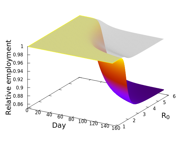
The implication is that the economic cascade that would result from maintaining an open economy during COVID-19 in 2020 would have had more severe consequences for Fresno than it would have for LA. In the next post we will compare the results for all the California SESs, and explore the features of those socioeconomic systems driving the differences. Before that, however, I’ll leave you with this nifty alternative graphic of the simulation results. These plots, that look like wedges of cheese to me, are simply “fill-ins” of the gap between disease-only driven unemployment, and that driver plus the economic cascade. Lining up LA and Fresno side by side allows me to appreciate how differently the two SESs are predicted to respond. In the next post we’ll look at the cheese wedges for all the SESs, and compare them across the state.


 is the number of employees in i, and
  is the rate at which workers are being lost–in that sector. We assume that workers are lost either to fatality, or because they suffer severe illness and are no longer able to work. We also assume that no new employees are being added, which was largely true at the beginning of the lockdowns, and therefore that the growth rate is always zero (if there is no disease then
  ) or negative (
 ).
).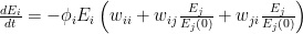
 is the relative weight of the flow from i to j (
 refers to exchanges within sector i itself). The value of the exchange is this weight multiplied by the number of employees in sector j at time t (
 ) relative to the original number of employees (at time 0).
 ![\frac{dE_i}{dt} = -\phi_i E_i \left [ w_{ii} + \sum_{j=1}^{S}\left ( w_{ij}\frac{E_j}{E_j(0)} + w_{ji}\frac{E_j}{E_j(0)}\right ) \right ]](https://s0.wp.com/latex.php?latex=%5Cfrac%7BdE_i%7D%7Bdt%7D+%3D+-%5Cphi_i+E_i+%5Cleft+%5B+w_%7Bii%7D+%2B+%5Csum_%7Bj%3D1%7D%5E%7BS%7D%5Cleft+%28+w_%7Bij%7D%5Cfrac%7BE_j%7D%7BE_j%280%29%7D+%2B+w_%7Bji%7D%5Cfrac%7BE_j%7D%7BE_j%280%29%7D%5Cright+%29+%5Cright+%5D&bg=ffffff&fg=000&s=0&c=20201002)
![\frac{dE_i^*}{dt} = -\phi_iE_i^*\left [w_{ii} + \left (\sum_{j=1}^S \mu_{ij}E_j^*\right )\right ]](https://s0.wp.com/latex.php?latex=%5Cfrac%7BdE_i%5E%2A%7D%7Bdt%7D+%3D+-%5Cphi_iE_i%5E%2A%5Cleft+%5Bw_%7Bii%7D+%2B+%5Cleft+%28%5Csum_%7Bj%3D1%7D%5ES+%5Cmu_%7Bij%7DE_j%5E%2A%5Cright+%29%5Cright+%5D&bg=ffffff&fg=000&s=0&c=20201002)
 represents the value of exchanges between sectors. Really, all the equation says is: THE SOCIOECONOMIC SYSTEM WILL REMAIN IN EQUILIBRIUM UNLESS WORKERS ARE REMOVED FROM ANY SECTOR BECAUSE OF ILLNESS OR DEATH. This should be obvious, because in the absence of COVID-19,


 indicate whether species i preys on species j. The question is, what is the interaction between two consumer species, i and m. My first step is to simply count the number of prey shared between i and m, measured as the
  and
and  rows; let’s designate that
  (
( ). We can refine our view a bit by asking what fraction of a species’ prey is represented by that overlap, which is simply
 is the in-degree, or number of prey for species i in the food web network. You can think of this as the potential impact of species m on i. This is not quite satisfactory though, because
  may be vastly different. For example, in our
  . Then weight the interaction strength between m and its prey uniformly according to


 in keeping with a conventional symbol for competitive interaction, but again point out that this is a very unparameterized measure compared to what is normally considered for use in Lotka-Volterra-type models or as measured empirically. You’ll notice that the values increase as the specialization of the interactors increases. It would be nice to scale these to a unit maximum to facilitate comparison, but I haven’t done that yet.
 , then that probability is a hypergeometric solution

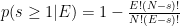


 . But the formula gives
![p(s\geq 1\vert E=1) = \left [ 1 - \frac{2!(3-1)!}{3!(2-1)!}\right ] \left [ 1 - \frac{2!(3-2)!}{3!(2-2)!}\right ]^{2} = \frac{4}{27}](https://s0.wp.com/latex.php?latex=p%28s%5Cgeq+1%5Cvert+E%3D1%29+%3D+%5Cleft+%5B+1+-+%5Cfrac%7B2%21%283-1%29%21%7D%7B3%21%282-1%29%21%7D%5Cright+%5D+%5Cleft+%5B+1+-+%5Cfrac%7B2%21%283-2%29%21%7D%7B3%21%282-2%29%21%7D%5Cright+%5D%5E%7B2%7D+%3D+%5Cfrac%7B4%7D%7B27%7D&bg=ffffff&fg=000&s=0&c=20201002)
