
Roopnarine, P. D., M. Abarca, D. Goodwin and J. Russack. 2023. Economic cascades, tipping points, and the costs of a business-as-usual approach to COVID-19. Frontiers in Physics. 11:1074704. doi: 10.3389/fphy.2023.1074704
And…the blog is back after a little unplanned-for break due to COVID-19. After having successfully avoided the disease for three years, my luck finally ran out. Note: vaccination and Paxlovid work! But it still sucked. 
Structural Complexity
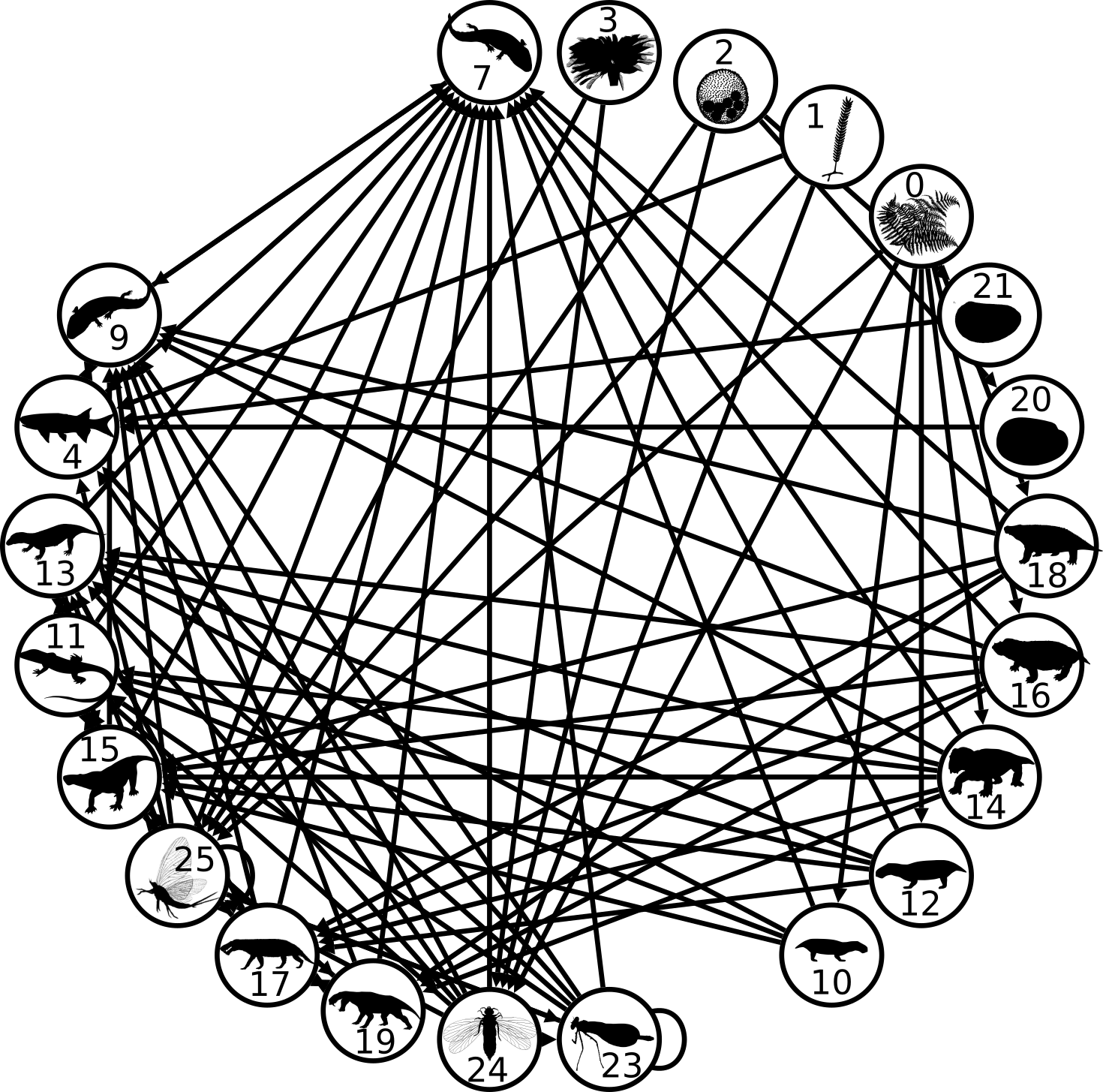
One of the remarkable features that is emerging from the study of ecosystems is that they, like many other types of complex systems, can be remarkably persistent–they last for considerable periods of time. What paleoecologists have been learning is that ecosystems have somewhat definable durations, “lifespans” if you will, over which they will arise and eventually disappear or transform. More intriguingly, if we describe an ecosystem according to its functions, or the various roles that species are performing in the system, then both the set of functions and the processes that they form through their interactions, tend to last much longer than the species that are performing those functions. In other words, species may come and go because of evolution (or immigration) and extinction, but the structure of the system remains the same. My personal favourite demonstration of this comes from a study of mammalian assemblages from the Iberian Peninsula spanning a time period of about 20 million years ago almost to the present1,2. In that story, waves of mammals would sweep into the peninsula across the Pyrenees Mountains and replace resident species, but would in no way alter the way in which the ecosystem was structured. That happened only a few times, driven by major changes of climate. Each paleoecosystem lasted on average 10 million years, whereas species tended to persist only 1-2 million years.
In yet another study, this one by myself and colleagues of an ancient ecosystem 260-245 million years ago in today’s Karoo Basin of South Africa, we described a situation very similar to the later Iberian one–species came and went in an otherwise structurally unchanging system. Unchanging, that is, until a mass extinction struck at 251 million years. The end Permian mass extinction, the most severe known in the fossil record, eventually undid the Karoo system. What followed was a succession of short-lived systems, and it wasn’t until about 7 million years later that a new and persistent system arose. We were able to determine that great persistence, or lack of it, depends on three systems characteristics: the types of ecological functions present in a system, the network of interactions among those functions, and how the total number of species in the system (species richness) is divided up among those functions (see above figure). We referred to this collection of traits as the “structural complexity” of a system.
Socioeconomic systems and structural complexity

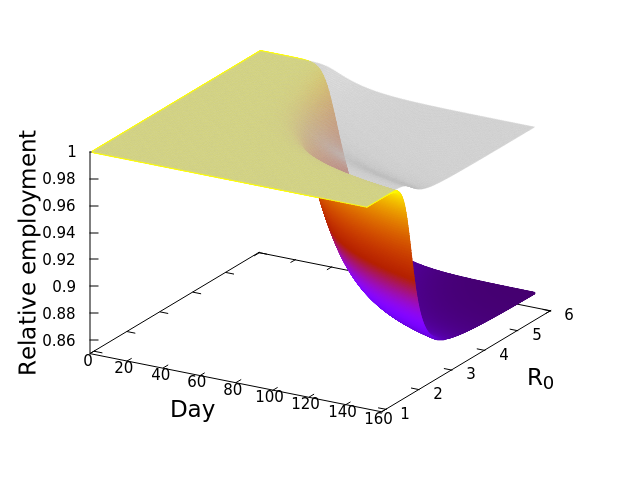
These “cheese wedge” figures were introduced in the previous post. They illustrate the responses of a socioeconomic system (SES) to a range of outbreak intensities of COVID-19, with both the depth and colouration of the wedges indicating the extent to which employment is expected to decline according to our CASES model; the deeper the wedge, the greater the loss of employment. We connected these results of SES-COVID dynamics to SES structure by analyzing the structural complexity of the California SESs. If you recall, the network of interactions between industrial sectors in the SESs is complete–all sectors interact with each other. This stands in contrast to ecosystems, where interactions among functions are more sparse, and in fact dense functional networks would probably be disastrous (see Red Queen for a Day). The upshot is that we need consider only a single feature of structural complexity in the SESs: how the total number of workers is divided among industrial sectors.
There is a total of fifteen sectors, and not only would we like to compare how a sector varies among SESs, for example, how many people are employed in Manufacturing in Los Angeles versus Fresno, but we also wish to account for how sectors vary with regards to other sectors, both within and between SESs. For example, do SESs with large Financial Services sectors also have large Health and Education sectors? And, most importantly, is there any relationship between the structural complexity of an SES and its predicted response to an outbreak of COVID? We turned to a mathematical technique called principal components analysis (PCA) to answer these questions. In our case, a PCA analysis uses both the sizes of sectors, and the relative sizes of sectors–what fraction of workers are in each sector–to compare SESs. It works like this. Imagine that we plotted our SESs on axes according to sector sizes. The next figure shows the SESs plotted in 2-dimensional spaces, where each dimension represents a sector, and each point is an SES, the location of which depends on how large the sectors are in that SES (the numbers are relative to the mean value of all the SESs, in tens of thousands). Pulling all the sectors together, we can imagine each SES to be a distinct point in a 15-dimensional space. We can imagine this in an abstract way, but as humans we can “typically” imagine no more than 3-dimensional spaces.

One of the great advantages of techniques such as PCA is that they can usefully condense or summarize variation in many dimensions into new dimensions by taking advantage of the fact that the original dimensions are correlated–back to the notion that larger Financial Services sectors co-occur with larger Health and Education sectors. And because the new dimensions, known as principal components, account for correlation among the original ones, they capture more of the original variation in fewer dimensions. The hoped for result is that we can then begin to view our data in a space that is more manageable, in our case, fewer than 15 dimensions.

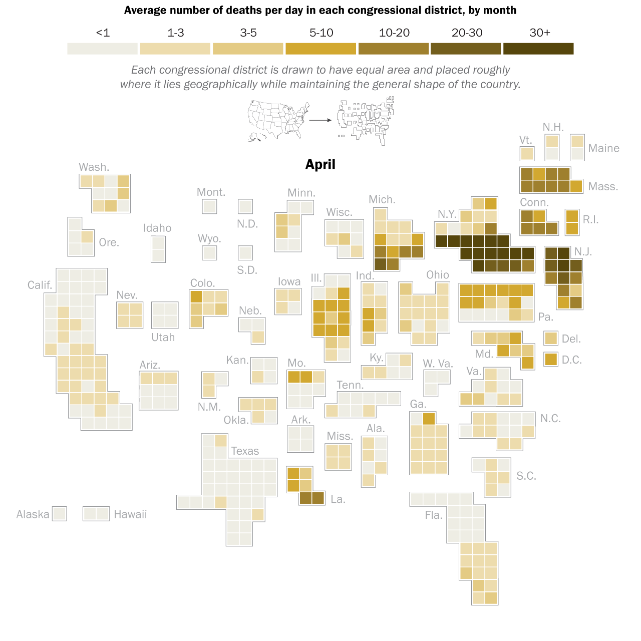
Here is the result of the PCA. It’s a busy figure, so let’s unpack it. First note the arrows that are pointing in several different directions. These are our original dimensions, or industrial sectors, and more than 90% of their variation is now captured by only two principal components (the x and y axes). Now look at our data points, the SESs. They are scattered in directions that indicate the relative sizes of the sectors in their structures. For example, the Agriculture (Farming) sector is relatively larger in Fresno than it is in San Francisco or Los Angeles. In general, there are two contrasting directions: Agricultural dominance versus all the other sectors, captured by Principal Component 1 (x axis), and goods-producing versus services-providing sectors (e.g. Mining and Logging versus Financial Services). The arrangement, or “ordination” of the SESs produced by the PCA is easily relatable to the reality of the communities that they represent, and we have great confidence that the results of this analysis gives us an insightful comparison of the structural complexities of the SESs.
Now, here’s the really interesting part. Alongside each point we plotted the cheese wedges for each SES, showing how our model predicts it would respond, employment-wise, to an economically unmitigated outbreak of COVID. The striking feature is that the severity of impact diminishes as we move from left to right in the figure (the wedges become smaller). The SESs also increase in size as we move in the direction, leading toward the behemoth Los Angeles SES, but it isn’t size per se that is driving the pattern; its a bit more subtle. It is the composition of the SESs. An SES that is smaller tends to have a relatively larger Agriculture sector, and goods-producing sectors in general, such as Manufacturing, whereas larger SESs tend to have relatively larger services sectors, such as Financial Services, and Leisure and Entertainment. Some of the contrast between California’s inland and coastal communities is also reflected, although there are exceptions, such as Oxnard’s location to the far left. And in the next post we’ll discuss an additional factor, and that is the age of the workforce in an SES, because remember, age and severity are related when it comes to COVID-19.
The main message of the analysis is this: Californian SESs would respond differently to COVID outbreaks in the absence of economic shutdowns, and in a manner based on their sizes, geography, and how their workforces are divided among industrial sectors. In the next post we will explore exactly how those differences would have been predicted to play out according to the CASES model.
References
- Blanco, F., Calatayud, J., Martín-Perea, D. M., Domingo, M. S., Menéndez, I., Müller, J., … & Cantalapiedra, J. L. (2021). Punctuated ecological equilibrium in mammal communities over evolutionary time scales. Science, 372(6539), 300-303.
- Roopnarine, P. D. and R. M. W. Banker. 2021. Perspective: Ecological stasis on geological timescales. Science 372:237-238.
 in the
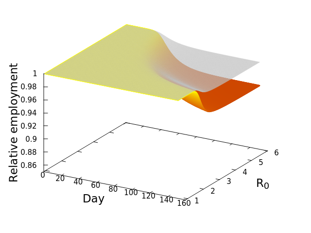


![\frac{dE_i^*}{dt} = -\phi_iE_i^*\left [w_{ii} + \left (\sum_{j=1}^S \mu_{ij}E_j^*\right )\right ]](https://s0.wp.com/latex.php?latex=%5Cfrac%7BdE_i%5E%2A%7D%7Bdt%7D+%3D+-%5Cphi_iE_i%5E%2A%5Cleft+%5Bw_%7Bii%7D+%2B+%5Cleft+%28%5Csum_%7Bj%3D1%7D%5ES+%5Cmu_%7Bij%7DE_j%5E%2A%5Cright+%29%5Cright+%5D&bg=ffffff&fg=000&s=0&c=20201002)
 by showing that
![\frac{dE_i^*}{dt} = -\sum_{n=1}^4 \left [E_{i,n}^*\phi_{i,n}\left [w_{ii} + \sum_{j=1}^{15}\left (\mu_{ij}E_j^*\right )\right ]\right ]](https://s0.wp.com/latex.php?latex=%5Cfrac%7BdE_i%5E%2A%7D%7Bdt%7D+%3D+-%5Csum_%7Bn%3D1%7D%5E4+%5Cleft+%5BE_%7Bi%2Cn%7D%5E%2A%5Cphi_%7Bi%2Cn%7D%5Cleft+%5Bw_%7Bii%7D+%2B+%5Csum_%7Bj%3D1%7D%5E%7B15%7D%5Cleft+%28%5Cmu_%7Bij%7DE_j%5E%2A%5Cright+%29%5Cright+%5D%5Cright+%5D&bg=ffffff&fg=000&s=0&c=20201002)
 , at which workers are removed from the workforce (summed over all 15 sectors and 4 age categories). And that we measured as,


 is the number of employees in i, and
  is the rate at which workers are being lost–in that sector. We assume that workers are lost either to fatality, or because they suffer severe illness and are no longer able to work. We also assume that no new employees are being added, which was largely true at the beginning of the lockdowns, and therefore that the growth rate is always zero (if there is no disease then
  ) or negative (
 ).
).
 is the relative weight of the flow from i to j (
 refers to exchanges within sector i itself). The value of the exchange is this weight multiplied by the number of employees in sector j at time t (
 ) relative to the original number of employees (at time 0).
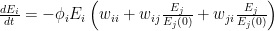
 ![\frac{dE_i}{dt} = -\phi_i E_i \left [ w_{ii} + \sum_{j=1}^{S}\left ( w_{ij}\frac{E_j}{E_j(0)} + w_{ji}\frac{E_j}{E_j(0)}\right ) \right ]](https://s0.wp.com/latex.php?latex=%5Cfrac%7BdE_i%7D%7Bdt%7D+%3D+-%5Cphi_i+E_i+%5Cleft+%5B+w_%7Bii%7D+%2B+%5Csum_%7Bj%3D1%7D%5E%7BS%7D%5Cleft+%28+w_%7Bij%7D%5Cfrac%7BE_j%7D%7BE_j%280%29%7D+%2B+w_%7Bji%7D%5Cfrac%7BE_j%7D%7BE_j%280%29%7D%5Cright+%29+%5Cright+%5D&bg=ffffff&fg=000&s=0&c=20201002)
 represents the value of exchanges between sectors. Really, all the equation says is: THE SOCIOECONOMIC SYSTEM WILL REMAIN IN EQUILIBRIUM UNLESS WORKERS ARE REMOVED FROM ANY SECTOR BECAUSE OF ILLNESS OR DEATH. This should be obvious, because in the absence of COVID-19,


