The Palaeontological Association has been running a fun series of essays in its newsletter entitled “Palaeontology’s greatest ever graphs”. I was kindly invited by the editor Emilia Jarochowska to write the latest essay, which featured this iconic graph published by Phil Gingerich in 1983 (wonderfully recreated and cartoonified by Ratbot Comics). The figure compiled data on measured rates of morphological evolution, plotting them against the interval of time over which the rate was measured. In other words, say I measured the rate of evolution of a species of snail every generation, and generations last one year, I would then plot those rates against one year. When Gingerich compiled rates ranging over intervals spanning days to millions of years, he got the inverse relationship (negative slope) shown in the figure. In other words, the longer the interval of time, the slower the measured rate! Debate raged over whether this was an actual biological feature, wherein rates at different times could differ greatly, or whether it was some sort of mathematical, or even psychological artifact. Well, here’s my take on it. And if you like the figure, head over to Ratbot Comics where you will find some truly fun stuff from the artist, Ellis Jones. Enjoy.
Inverse relationship of evolutionary rates and interval of time over which rates were measured
The rates at which morphological evolution proceeds became a central palaeontological contribution to development of the neo-synthetic theory of evolution in the mid-twentieth century (Simpson, 1944; Haldane, 1949). Many decades later we can say retrospectively that three questions must qualify the study of those rates. First, how is rate being measured? Second, at which level or for what type of biological organization is rate being measured, e.g. within a species or within a clade (Roopnarine, 2003)? Third, why do we care about rate? In other words, what might we learn from knowing the speed of morphological evolution?
The figure presented here illustrates a compilation of rates of morphological evolution calculated within species, or within phyletic lineages of presumed relationships of direct ancestral- descendant species (Gingerich, 1983). The most obvious feature is the inverse relationship between rate and the interval of time over which a rate is measured. The compilation included data derived from laboratory experiments of artificial selection, historical events such as biological invasions, and the fossil record. The rates are calculated in units of “darwins”, i.e., the proportional difference between two measures divided by elapsed time standardized to units of 1 million years (Haldane, 1949). This makes 1 darwin roughly equivalent to a proportional change of 1/1000 every 1,000 years. Haldane’s interest in rates was to determine how quickly phenotypically expressed mutations could become fixed in a population, and he expected the fossil record to be a potential source of suitable data. Later, Bjorn Kurtén (1959), pursuing this line of thinking was, I believe, the first to note that morphological change, and hence rate, decreased as the interval of time between measured points increased. Kurtén, who was measuring change in lineages of mammals from the Tertiary, Pleistocene and Holocene, throughout which rates increased progressively, suggested two alternative explanations for the inverse relationship: (1) increasing rates reflected increasingly variable climatic conditions as one approached the Holocene, or (2) the trend is a mathematical artifact. Philip Gingerich compiled significantly more data and suggested that the decline of rates as measurement interval increases might indeed be an artifact, yet a meaningful one. To grasp the significance of Gingerich’s argument, we must dissect both the figure and Kurtén’s second explanation.
The displayed rates vary by many orders of magnitude, and Gingerich divided them subjectively into four domains, with the fastest rates occupying Domain I and coming from laboratory measures of change on generational timescales. The slowest rates, Domain IV, hail exclusively from the fossil record. Kurtén suggested that, as the geological span over which a rate is calculated increases, the higher the frequency of unobserved reversals of change. Thus change that might have accumulated during an interval could be negated to some extent during a longer interval, leading to a calculated rate that is slower than true generational rates. Gingerich regressed his compiled rates against the interval of measurement, and not only validated Kurtén’s observation for a much broader set of data, but additionally asserted that if one then scales rate against interval, the result is unexpectedly uniform. This implies no difference between true generational rates, rates of presumed adaptation during historical events, and phyletic changes between species on longer timescales. It is a simple leap from here to Gingerich’s main conclusion, that the process or evolutionary mode operating within the domains is a single one, and there is thus no mechanistic distinction between microevolutionary and macroevolutionary processes.
Perhaps unsurprisingly, the first notable response to Gingerich’s claim was made by Stephen Gould (1984), a founder of the Theory of Punctuated Equilibrium, and a major force in the then developing macroevolutionary programme. A major tenet of that programme is that there exists a discontinuity between microevolutionary processes that operate during the temporal span of a species, and macroevolutionary processes that are responsible for speciation events and other phenomena which occur beyond the level of populations, such as species selection. Gould objected strongly to Gingerich’s argument, and presented two non-exclusive alternative explanations. Appearing to initially accept a constancy of rate across scales, Gould argued that the inverse relationship between rate and interval must require the amount of morphological change to also be constant. He found Gingerich’s calculated slope of 1.2, however, to be suspiciously close to 1, pointing towards two psychological artifacts. First, very small changes are rarely noticed and hence reported, essentially victims of the bias against negative results. Second, instances of very large change tend to be overlooked because we would not recognize the close phyletic relationship between the taxa. This second explanation strikes directly from the macroevolutionist paradigm. Gould proposed that the very high rates measured at the shortest timescales (Domain I) are a biased sample that ignores the millions of extant populations that exhibit very low rates. This bias creates an incommensurability with rates measured from the fossil record, which would be low if morphological stasis is the dominant mode of evolution on the long term.
Gingerich and Gould, observing the same data, arrived at opposing explanations. Neither party, unfortunately, were free of their own a priori biases concerning the evolutionary mechanism(s) responsible for the data. A deeper consideration of the underlying mathematics reveals a richer framework behind the data and figure than either worker acknowledged. Fred Bookstein (1987) provided the first insight by modelling unbiased or symmetric random walks as null models of microevolutionary time series. Bookstein pointed out that for such series, the frequency of reversals is about equal to the number of changes in the direction of net evolution between any two points. In other words, if a species trait increased by a factor of x when measured at times t1 and t2, the number of generations for which the trait increased is roughly equal to the number of generations for which it decreased (in the limit as series length approaches infinity). “Rate” becomes meaningless for such a series beyond a single generational step! In one fell swoop, Bookstein rendered the entire argument moot, unless one could reject the hypothesis that the mode of trait evolution conformed to a random walk. He also, however, opened the door to a better understanding of the inverse relationship: measures of morphological change over intervals greater than two consecutive generations cannot be interpreted independently of the mode or modes of evolution that operated during the intervals.
In order to understand this, imagine a time series of morphological trait evolution generated by an unbiased random walk. That is, for any given generation the trait’s value, logarithmically transformed, can decrease or increase with equal probability by a factor k, the generational rate of evolution. The expected value of the trait after N generations will be x0±kN0.5 (see Berg, 2018 for an accessible explanation), where x0 is the initial value of the trait. Selecting any two generations in the series and calculating an interval rate then yields (xN-x0)/N = kN0.5/N = kN-0.5. Logarithmic transformation of the interval, as done in the figure, will thus yield a slope of -0.5. Alternatively, suppose the mode of evolution was incrementally directional (a biased random walk), then the expected rate would simply be kNa, where a>-0.5. The expected rate generated by a perfectly directional series would be kN0, yielding a slope of rate versus interval of 0 (I’ll leave the proof to readers; or see Gingerich, 1993 or Roopnarine, 2003). And finally, a series that was improbably constrained in a manner often envisioned by Gould and others as stasis (Roopnarine et al., 1999), would yield a slope close to -1. Gingerich (1993) exploited these relationships, using all the available observations from a stratophenetic series to classify the underlying mode, and presumably test the frequency with which various modes account for observed stratophenetic series: slope 0 – directional, ~-0.5 – random, -1 – stasis. The method suffered complications arising from the regression of a ratio on its denominator (Gould, 1984; Sheets and Mitchell, 2001; Roopnarine, 2003), and the fact that the statistics of evolutionary series converge to those of unbiased random walks as preservational incompleteness increases (Roopnarine et al., 1999). It is nevertheless intimately related to the appropriate mathematics (Roopnarine, 2001).
Ultimately, we can use these relationships to understand that the inverse proportionality between rates and their temporal intervals is compelled to be negative because of mathematics, and only mathematics. Given that no measures of morphology are free of error, and that it is highly improbable that any lineage will exhibit perfect monotonicity of evolutionary mode during its geological duration, then all slopes of the relationship must lie between -1 and 0. Furthermore, the distribution of data within and among the four domains by itself tells us very little about mode, for it consists of point measures taken from entire histories, and those measures cannot inform us of the modes that generated them. Gingerich’s method (1983, 1993) might have been problematic, but it provided a foundation for further developments that demonstrated the feasibility of recovering evolutionary mode from stratophenetic series (Roopnarine, 2001; Hunt, 2007). Perhaps it is time to circle back to this iconic figure and broadly reassess the distribution of evolutionary rates in the fossil record (Voje, 2016).
References
BERG, H. C. 2018. Random walks in biology. Princeton University Press, 152 pp.
BOOKSTEIN, F. L. 1987. Random walk and the existence of evolutionary rates. Paleobiology, 13 (4), 446–464.
GINGERICH, P. D. 1983. Rates of evolution: effects of time and temporal scaling. Science, 222 (4620), 159–161.
GINGERICH, P. D. 1984. Response: Smooth curve of evolutionary rate: A psychological and mathematical artifact. Science, 226 (4677), 995–996.
GOULD, S. J. 1984. Smooth curve of evolutionary rate: a psychological and mathematical artifact. Science, 226 (4677), 994–996.
HALDANE, J. B. S. 1949. Suggestions as to quantitative measurement of rates of evolution. Evolution, 3 (1), 51–56.
HUNT, G. 2007. The relative importance of directional change, random walks, and stasis in the evolution of fossil lineages. Proceedings of the National Academy of Sciences, 104 (47), 18404–18408.
KURTÉN, B. 1959. Rates of evolution in fossil mammals. 205–215. In: Cold Spring Harbor Symposia on Quantitative Biology Vol. 24. Cold Spring Harbor Laboratory Press.
ROOPNARINE, P. D. 2001. The description and classification of evolutionary mode: a computational approach. Paleobiology, 27 (3), 446–465.
ROOPNARINE, P. D. 2003. Analysis of rates of morphologic evolution. Annual Review of Ecology, Evolution, and Systematics, 34 (1), 605–632.
ROOPNARINE, P. D., BYARS, G. and FITZGERALD, P. 1999. Anagenetic evolution, stratophenetic patterns, and random walk models. Paleobiology, 25 (1), 41–57.
SHEETS, H. D. and MITCHELL, C. E. 2001. Uncorrelated change produces the apparent dependence of evolutionary rate on interval. Paleobiology, 27 (3), 429–445.
SIMPSON, G. G. 1944. Tempo and Mode in Evolution. Columbia University Press, 217 pp.
VOJE, K. L. 2016. Tempo does not correlate with mode in the fossil record. Evolution, 70 (12), 2678–2689.


 in the
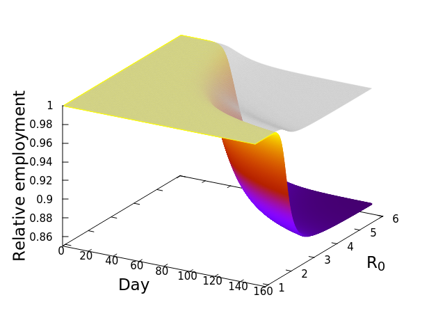


![\frac{dE_i^*}{dt} = -\phi_iE_i^*\left [w_{ii} + \left (\sum_{j=1}^S \mu_{ij}E_j^*\right )\right ]](https://s0.wp.com/latex.php?latex=%5Cfrac%7BdE_i%5E%2A%7D%7Bdt%7D+%3D+-%5Cphi_iE_i%5E%2A%5Cleft+%5Bw_%7Bii%7D+%2B+%5Cleft+%28%5Csum_%7Bj%3D1%7D%5ES+%5Cmu_%7Bij%7DE_j%5E%2A%5Cright+%29%5Cright+%5D&bg=ffffff&fg=000&s=0&c=20201002)
 by showing that
![\frac{dE_i^*}{dt} = -\sum_{n=1}^4 \left [E_{i,n}^*\phi_{i,n}\left [w_{ii} + \sum_{j=1}^{15}\left (\mu_{ij}E_j^*\right )\right ]\right ]](https://s0.wp.com/latex.php?latex=%5Cfrac%7BdE_i%5E%2A%7D%7Bdt%7D+%3D+-%5Csum_%7Bn%3D1%7D%5E4+%5Cleft+%5BE_%7Bi%2Cn%7D%5E%2A%5Cphi_%7Bi%2Cn%7D%5Cleft+%5Bw_%7Bii%7D+%2B+%5Csum_%7Bj%3D1%7D%5E%7B15%7D%5Cleft+%28%5Cmu_%7Bij%7DE_j%5E%2A%5Cright+%29%5Cright+%5D%5Cright+%5D&bg=ffffff&fg=000&s=0&c=20201002)
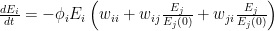
 , at which workers are removed from the workforce (summed over all 15 sectors and 4 age categories). And that we measured as,


 is the number of employees in i, and
  is the rate at which workers are being lost–in that sector. We assume that workers are lost either to fatality, or because they suffer severe illness and are no longer able to work. We also assume that no new employees are being added, which was largely true at the beginning of the lockdowns, and therefore that the growth rate is always zero (if there is no disease then
  ) or negative (
 ).
).
 is the relative weight of the flow from i to j (
 refers to exchanges within sector i itself). The value of the exchange is this weight multiplied by the number of employees in sector j at time t (
 ) relative to the original number of employees (at time 0).
 ![\frac{dE_i}{dt} = -\phi_i E_i \left [ w_{ii} + \sum_{j=1}^{S}\left ( w_{ij}\frac{E_j}{E_j(0)} + w_{ji}\frac{E_j}{E_j(0)}\right ) \right ]](https://s0.wp.com/latex.php?latex=%5Cfrac%7BdE_i%7D%7Bdt%7D+%3D+-%5Cphi_i+E_i+%5Cleft+%5B+w_%7Bii%7D+%2B+%5Csum_%7Bj%3D1%7D%5E%7BS%7D%5Cleft+%28+w_%7Bij%7D%5Cfrac%7BE_j%7D%7BE_j%280%29%7D+%2B+w_%7Bji%7D%5Cfrac%7BE_j%7D%7BE_j%280%29%7D%5Cright+%29+%5Cright+%5D&bg=ffffff&fg=000&s=0&c=20201002)
 represents the value of exchanges between sectors. Really, all the equation says is: THE SOCIOECONOMIC SYSTEM WILL REMAIN IN EQUILIBRIUM UNLESS WORKERS ARE REMOVED FROM ANY SECTOR BECAUSE OF ILLNESS OR DEATH. This should be obvious, because in the absence of COVID-19,


 is the rate at which individuals are removed from the “infected pool”, either by recovery, or by death. Thus you can see that reducing